The screen where a student agrees to lose marks.
An AI evaluation platform for professional education. My part was the student's side of it — everything between opening an assignment and the moment a submission becomes a grade, including the one screen where they decide to submit anyway.
01The problem
A student thinks the job is upload → submit → done. The system needs complete → readable → evaluable before grading can start at all. Nearly every platform reports that gap after submission, as a failure message.
By then it is not information, it is a verdict. The deadline has passed, the file is with the instructor, and the marks for whatever was missing are already gone. The student's first accurate picture of their own submission arrives at the exact moment they can no longer act on it.
Four separate gaps sit inside that, and they fail differently:
- Awareness. The rubric is a document somewhere else. Students routinely score zero on a criterion they did not know was being marked.
- Format and scan. A handwritten page photographed badly, a PDF that is secretly an image, a shared link nobody outside the author can open. All invisible to the person who uploaded them.
- Interpretation. Even a correct warning is useless if it does not say what it costs and how to fix it.
- Recovery. Finding out is only worth something if there is still a way back.
The client's own priority was not student experience — it was instructor load. Every escalation, every "I didn't know I needed that", every grade dispute lands on faculty. That reframed the work: nothing here earns its place unless it also reduces what reaches the instructor.
02What the decisions rest on
A team of six did this work, and most of the research was not mine, so every item names the role that owned it. The last column lists what nobody did. Each item says what it found, and which part of this page it changed.
Asked the client
Read the market
Mapped the problem
Checked the work
Not done said plainly
03The constraint that shaped everything
Most clients hide infrastructure cost from designers. This one put it on the table in week one: reading a document with a model is expensive, and at institutional scale the difference between checking something instantly and checking it in a queue is the difference between a business and a science project.
That is a design constraint wearing an engineering costume. It decides what a student can be told and when — so it decides the shape of every screen after upload. A product that promises real-time everything either lies or bankrupts the person paying for it.
So validation runs in three tiers, and the interface is honest about which one you are in:
- T1 — format, size, page count, whether the text is readable, which pages are handwritten, which links are inside. Instant, and no model runs. It happens as the file uploads.
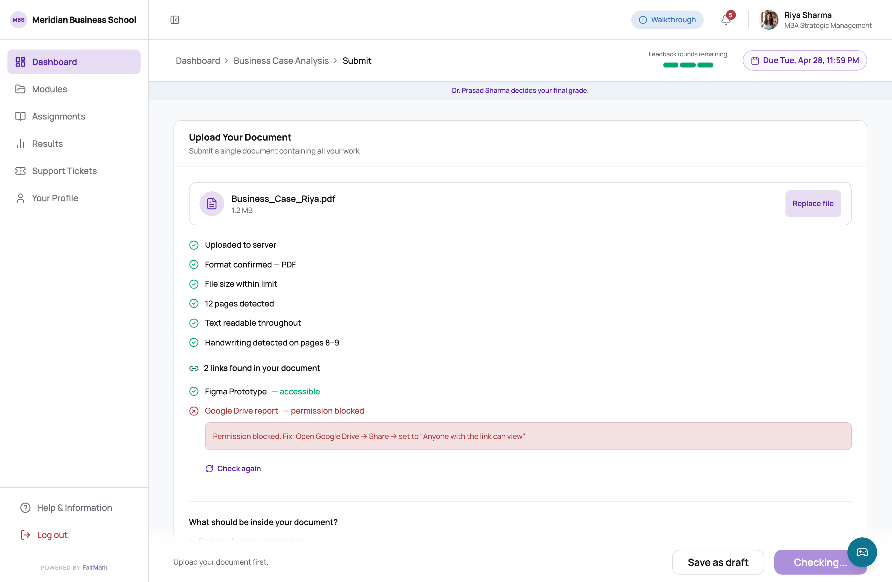
- T2 — whether those links open, whether they are shared, whether anything is behind them. Seconds, while the student is still on the page, because these are the failures a student can actually fix in the moment.
- T3 — reading the handwriting, and mapping the work to the rubric. The only tier that runs a model, so it is queued: minutes, not seconds. The student gets a time it will be ready by, and is released.
The split is not a compromise forced by cost. It is the correct division anyway: the fast checks are the ones you can act on standing at your laptop, and the slow one is the one you want to walk away from.
Stated as architecture, not preference
The client fixed two rules on day one: no evidence, no credit — the system only awards for what it can actually find — and the instructor is the final authority. Stating them as constraints rather than opinions removed an entire class of design argument before it could start.
The consequence runs through every screen: the AI never scores anything. It reads, and it reports what it found and where. Every post-submission screen carries the same sentence — your instructor decides your final grade — because in a market where the adoption risk is "a machine is marking my work", trust is built by repetition, not by a tooltip somebody dismissed once.
the first client meetingthe compute spec, tier by tier
04The student's path
There is no client feature list for this one, and inventing one would defeat the point. What exists is better evidence: the flow the team planned at the start of April, the build as it shipped on 26 April, and a commit history that says what changed in between, and why. Switch between them, or pick a change to see which steps it touched.
What changed between the two, and when
Every date is a commit in the build's history. The planned priorities come from the build's own screen inventory, where the upload itself was marked “if time allows” and the consent screen a must-have.
05The thread, screen by screen
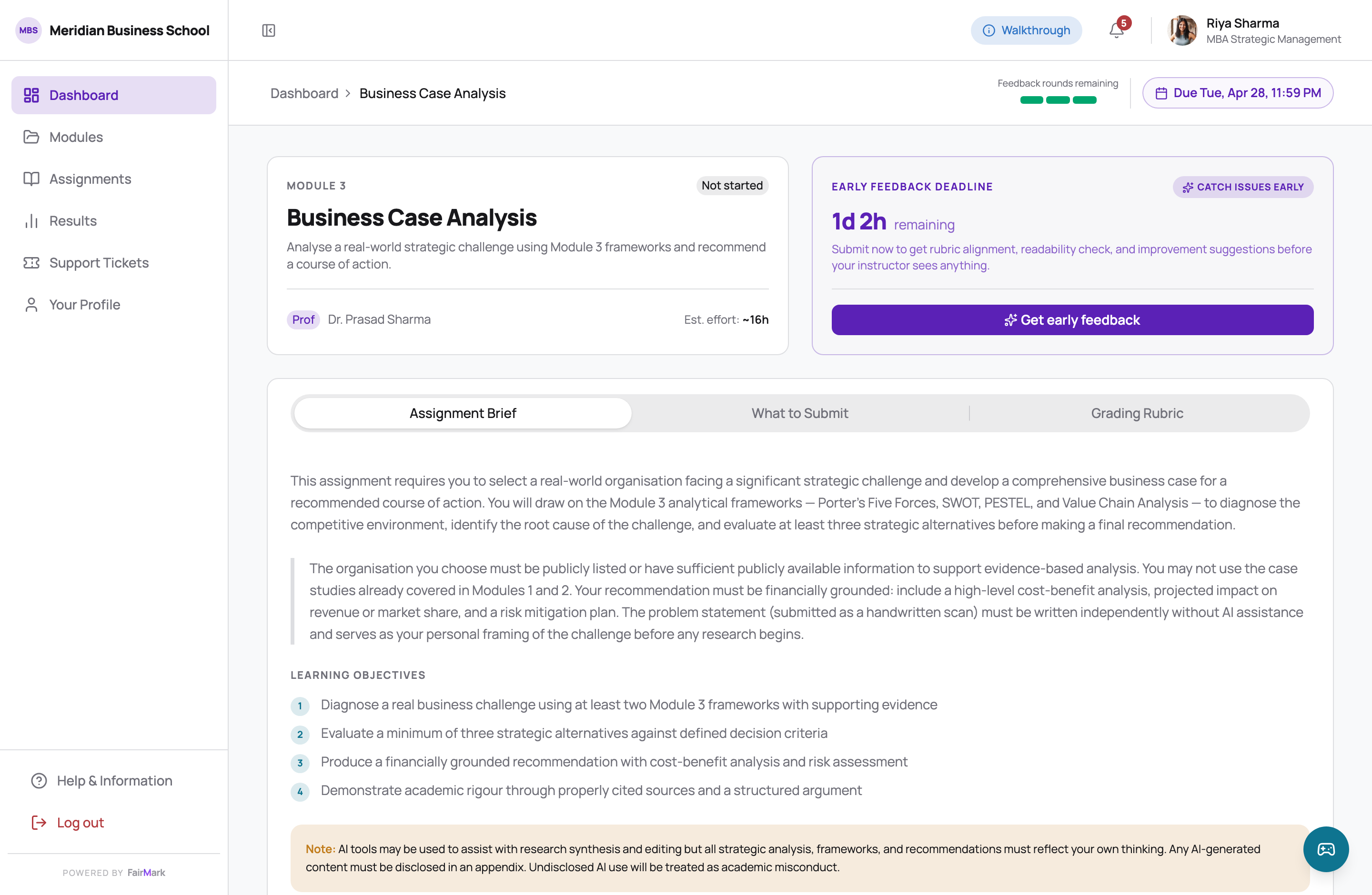
All of this is the running build, not a mockup. The countdowns are live, the data is seeded, and you can open any of it in the demo.
The incentive design is one line, sitting under the assignment card on the dashboard: submit early to unlock feedback. Early submission is not framed as diligence — it is framed as the only way to get something the late submitter cannot have.
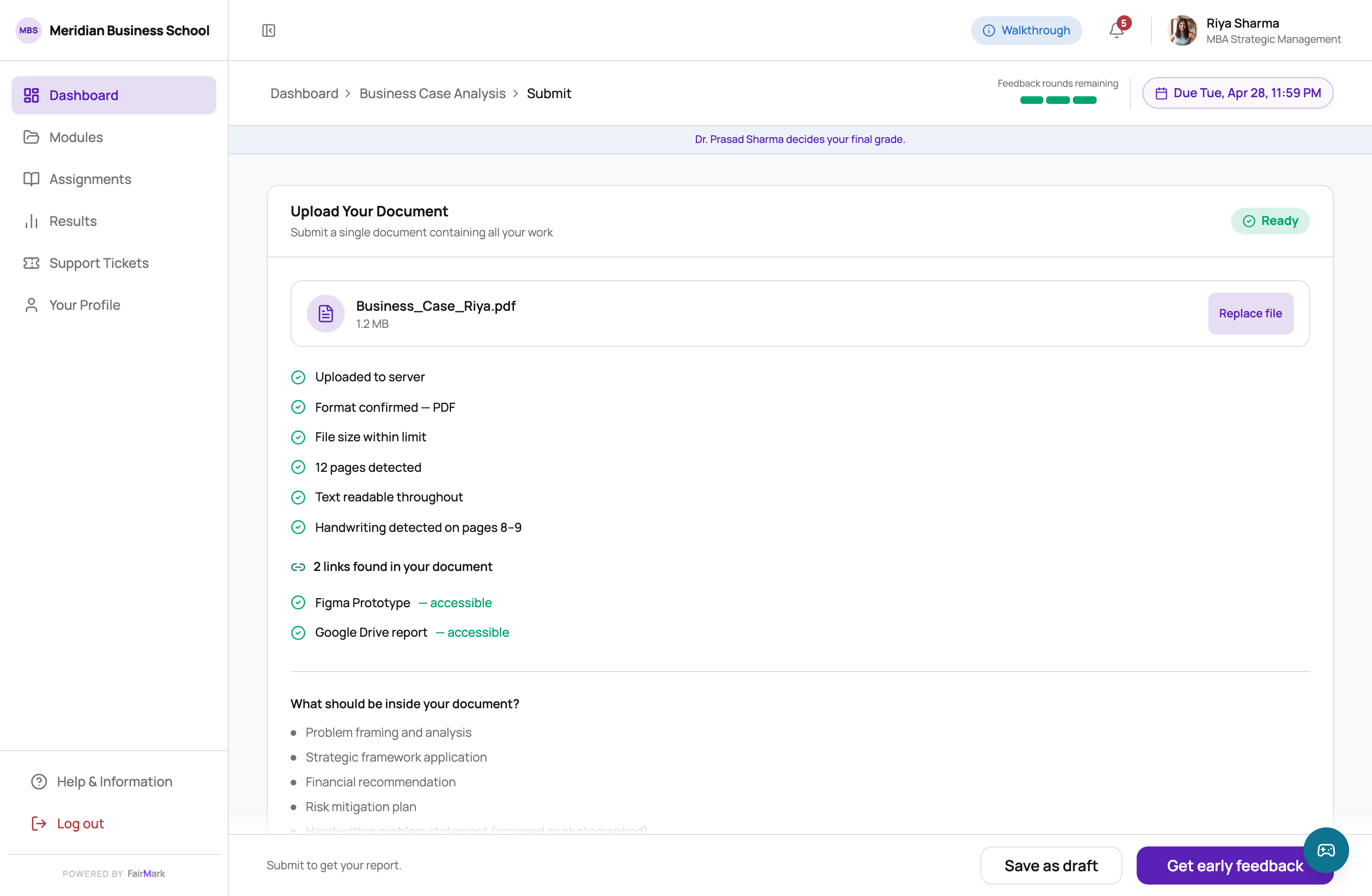
Showing the process here is right, and showing it during the rubric analysis would be wrong — the same mechanism, opposite call. On this screen every line is something the student can act on. During analysis they can only wait, and a list of checks ticking past is just a countdown to a verdict.
06The decision I'd defend
Every platform designs the success state and the failure state. Almost nobody designs the one in between, which is the only one that is actually hard.
The warning state is the dangerous one
Failures are easy: the system blocks, the student fixes, the system unblocks. Nobody has to decide anything.
A warning asks a nineteen-year-old to make an irreversible decision, under deadline pressure, on incomplete information. Read it as a blocker and they abandon a submission that was fine. Read it as noise and they lose marks they never understood they were agreeing to lose. Both readings are reasonable responses to “some issues were found.”
And it is the state that generates the dispute. Not the failure — the failure is unambiguous. The dispute comes from the student who proceeded without understanding what proceeding meant.
Consent has to be specific enough to be indefensible to argue with
A generic “I understand” is worth nothing to either side. It does not tell the student what they are giving up, and it does not give the institution anything to point at when the grade is challenged.
So the dialog does not summarise. It names each criterion, prints its exact weight, and states the consequence in the student's own currency — will not receive evidence credit for this criterion — 10% of your grade. Three named risks, not "3 issues".
Then it does the thing that makes it fair rather than merely defensible: it says you still have 1d 2h, and resubmitting cannot lower your grade. Informed consent is only real when refusing is genuinely available.
the decision log, day twothe client's two rules
The same three findings, summarised and then named. Both dialogs are drawn on this page rather than screenshotted — the total on the right is computed from the findings, which is exactly the sum the generic version makes impossible.
The argument for spending this much design on one dialog only holds if it pays off later, so here is where it lands. Two weeks on, the same student is looking at a grade.
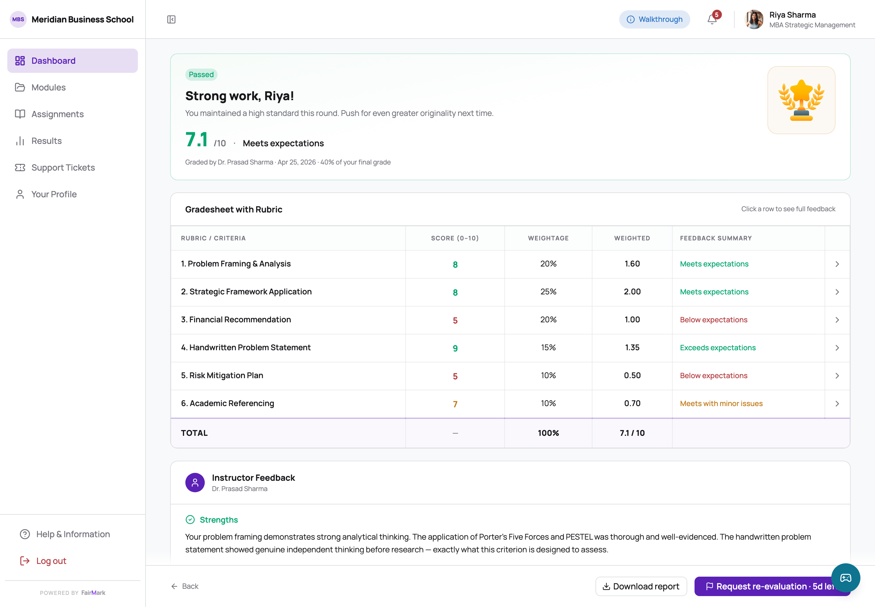
That is the return on the consent screen. A student who agreed to a specific, named, weighted risk is a student who can be shown that record, and an instructor facing a challenge has something better than memory. The dialog is not there to protect the institution from the student — it is there so the conversation two weeks later is about the work.
07A comparison the build makes better than I can
The same screen in two real states of the shipped build — nothing here is reconstructed or mocked up. Switch between them.
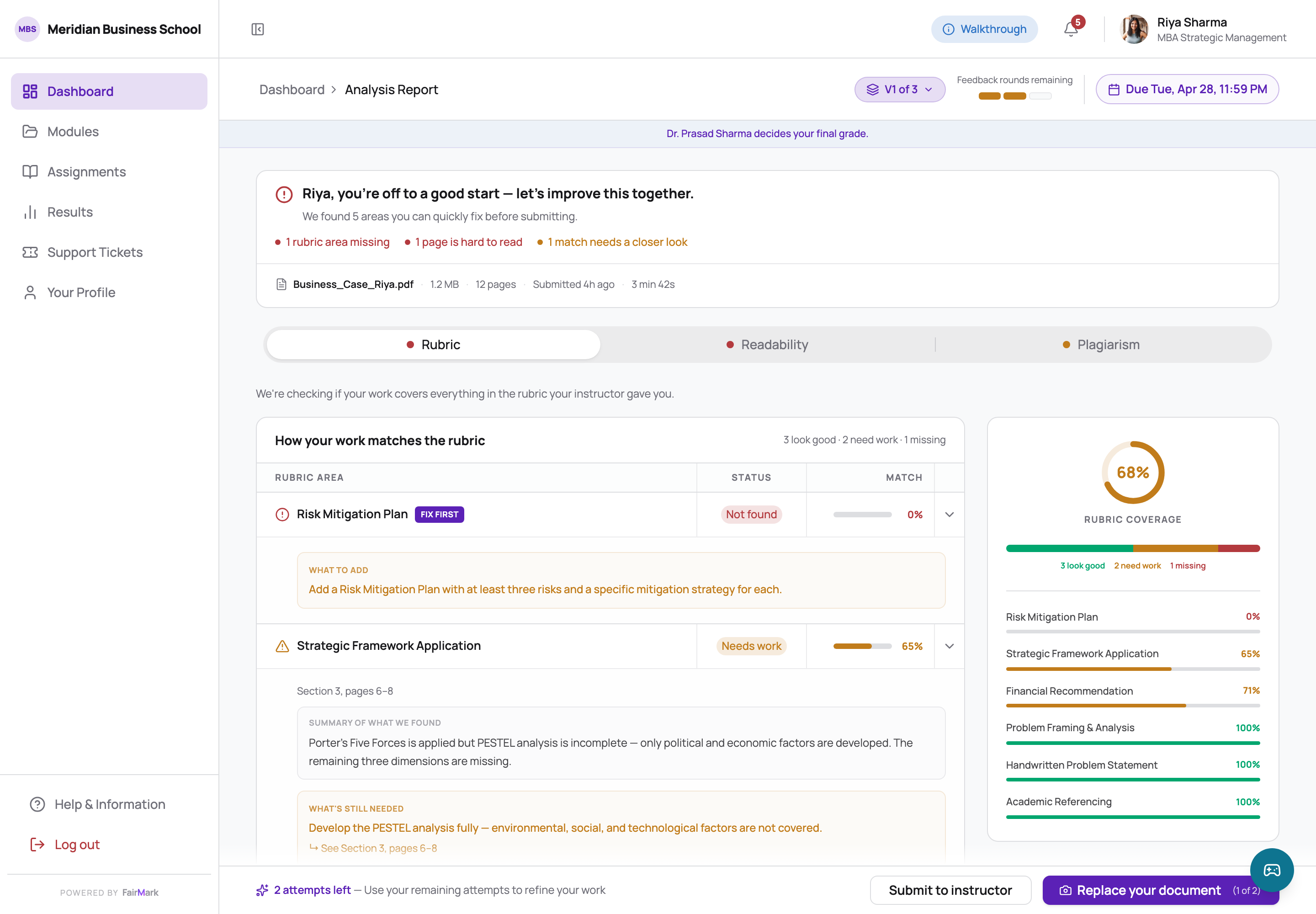
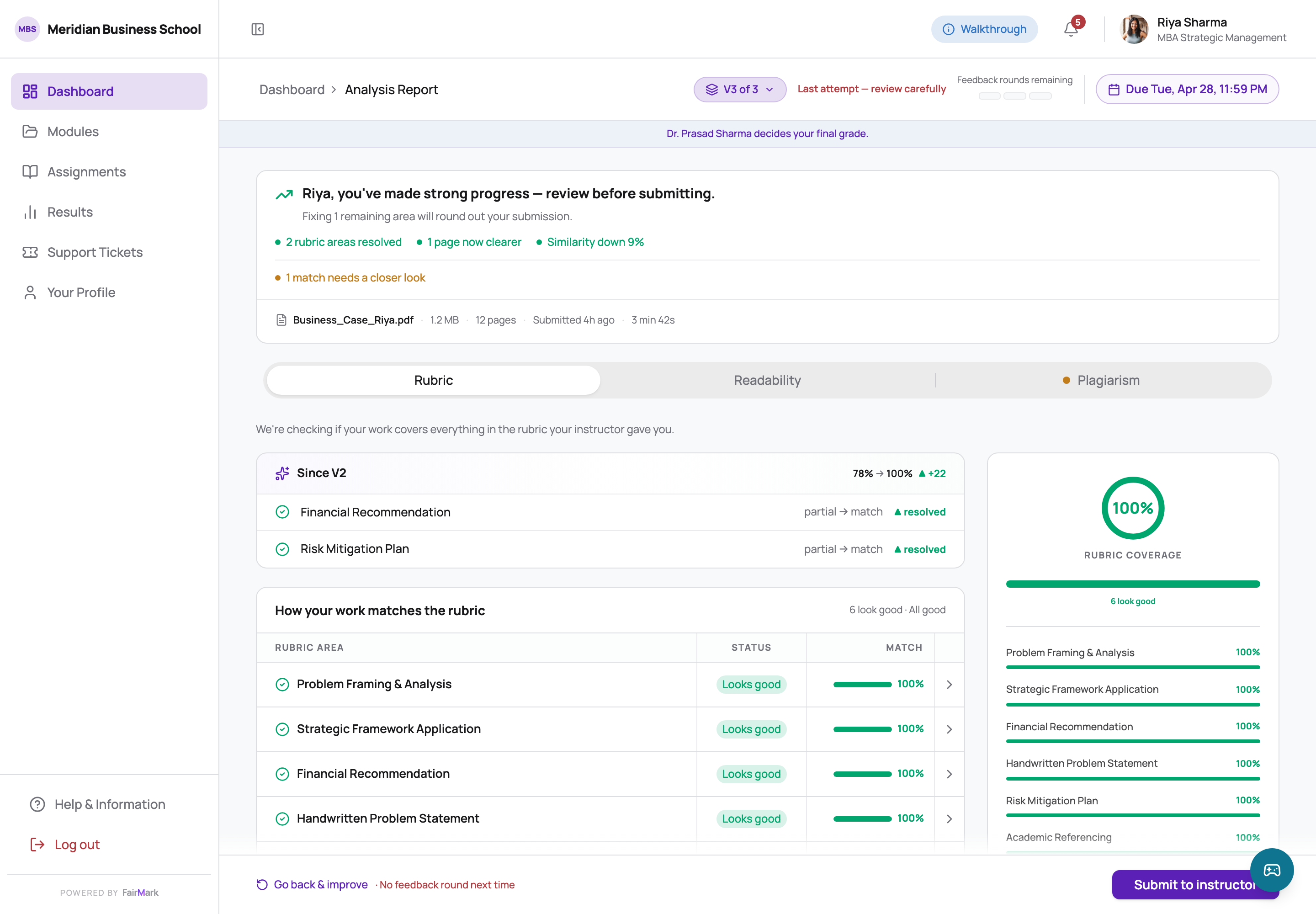
The entire argument for the product, in one screen twice. Left: 68% coverage, a criterion scored zero, similarity above the limit, "1 rubric area missing" in red. Right: the same student after two rounds — 100%, and a since V2 card that names what changed and does not make them hunt for it. The loop is the value; everything else is plumbing that makes the loop possible before the deadline.
The dashboard also comes in two voices. A student still building the habit gets coaching; an established one gets stretch work and less hand-holding. Only the copy changes between them — the layout is identical, by a team decision. The idea behind it, from the team's strategy work, was to group students by behaviour rather than grades: grades measure an outcome, behaviour measures a pattern.
08Three times the work had to be redone
The demo where the client agrees with everything is the one that taught you nothing.
We presented the prototype as a walk through one student's journey rather than a tour of features — lead with the anxious first-timer, then break the story with the students who behave differently. It worked, in the sense that it produced redirection instead of polite agreement.
He came back with three changes: support a single-document submission alongside the multi-file model, because faculty load makes consolidation matter more than structure; split validation into fast and queued rather than promising real-time; and add incentive layers to pull submissions earlier. About a third of what we had built stopped being relevant, and the rework was in the build four days later.
What held was the four principles underneath it. We changed the surfaces without relitigating the philosophy, which is the only reason a week-two scope expansion did not become a spiral.
A pre-submission validation preview, server-side storage of the consent record, and preserved validation state on resubmission so a student replacing one element does not re-run everything. All three make the product meaningfully better. All three depend on architecture decisions that were not ours to make.
They went into the decision log on day two, flagged as waiting on the client's architecture call, so nothing was promised by accident. But design effort still went into features whose foundations nobody had agreed, which is how you produce a beautiful thing that cannot ship.
Two came back in a cheaper shape: analysis before the final submit ships queued, with a time it will be ready by and a cap of three rounds, and a re-analysed report marks the criteria a change did not touch as unaffected. Nothing stores the consent record yet — the prototype has no server. The lesson the team wrote down afterwards: a feasibility check with a technical mentor in the middle of the sprint, before the next idea gets designed.
the decision log, day two
I built this alongside an AI coding agent, and it is very good at producing something plausible and very willing to drift. On day two it proposed flattening the card system to hairline dividers — cleaner, more current, genuinely defensible in isolation.
I took it, looked at it, and put it back. The cards are not decoration: they are what makes a validation result read as one object with a status, on a screen where six of them stack. Flat dividers turn six statuses into one long list.
The general version, which I now write down at the start of a build: a suggestion that is defensible in isolation can still be a regression, because the thing it breaks is somewhere else on the screen. Two more went the same way that day — a carousel flattened into a static list, and a status pill quietly swapped for a component-library default. Not every revert lasted: the carousel became a one-page popup the next day, and the orientation it belonged to was cut two weeks later.
the overrides log, day twothe commit history
09Where it landed
Shipped
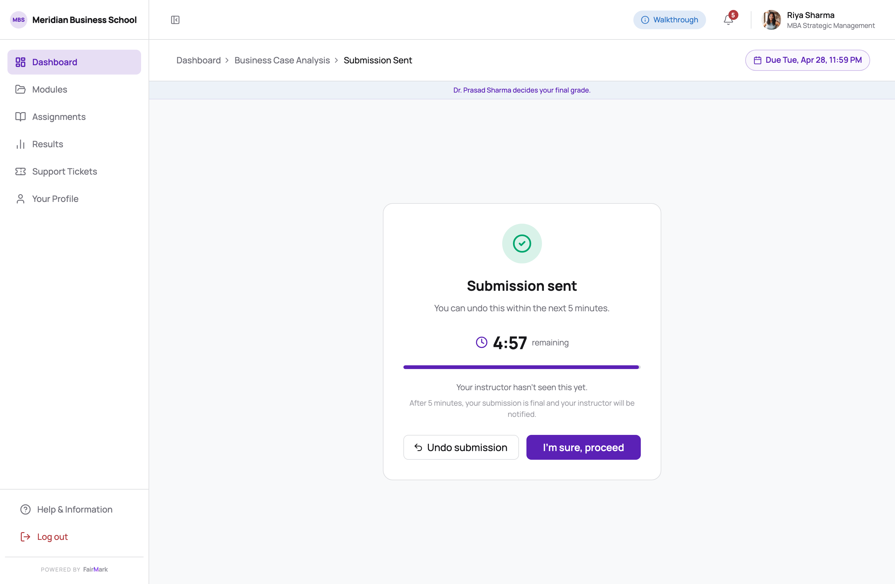
The student module, live at the link above: the brief and rubric, one submit page with instant and link checks, up to three rounds of queued feedback, consent that names what the student is giving up, five minutes to take it back, the grade, and a way to ask for it to be reviewed.
What I'd defend
The consent moment, in any room. The tier split falling out of a cost constraint rather than being bolted onto it. And spending the design effort on the warning state instead of the success state.
Not done
No student has used it. The personas come from the team's research, and they are still proxies. Nothing has been measured: where the internal documents project fewer disputes or support tickets, those are arguments for a design, not outcomes of one. And twenty-eight of the fifty-seven error states are not designed yet.
First test
One observed session with a first-generation student making their first submission, against a real deadline. The consent screen was designed calmly; it gets used by someone panicking at 11:47pm, and I do not know what it does to them.
This was a team of six. The strategy, the persona architecture, the systems modelling and the research were owned by other people. My strand was the build: the student module end to end, the design system underneath it, the compute-tier model, and shipping the thing that is running at the link above.
One housekeeping note, since the screenshots are the evidence: the institution branding in them is a neutral placeholder. The real build carries a named university as demo data, and putting that on my own site would imply a customer relationship that does not exist.
10Sources
The competitive audit behind the design covered eleven public platforms, read for three things — how grading is made transparent, how scanned and handwritten input is handled, and the gap between a system validating something and a student understanding it:
- 1Gradescope · Turnitin · Canvas LMS · Google Classroom · Blackboard — grading, submission and feedback surfaces
- 2Google Cloud Vision · Azure AI Vision · Amazon Textract — OCR behaviour, confidence reporting and failure modes on handwriting
- 3ETS · FICO · IBM ODM — how automated scoring and rules engines explain a decision to the person it lands on
The build carries its own reasoning: a decision log started on day two, a history of 103 commits between 1 and 26 April whose messages carry the running record, a defence document mapping each screen to the behaviour it is trying to produce, and a design system written down so the thing stays coherent across a four-week sprint. Those live in the repository, not in a deck.
FairMark is a name I gave this work to publish it — the client, their product and their institution partners stay unnamed, and the university in the screens is fictional for the same reason. Screens are the running build, captured at 2× — click any of them to read one at full size.